Friday 8 May 2015

Researching TV commercials

What makes a good TV advertisement?

A good TV advert should include memorable, iconic characters that they associate their brand with. For example, Digi, a mobile service provider in Malaysia, relate to the 'yellow man' as essentially, their brand revolves around the colour yellow and this is a part of their brand identity. As they continue to produce creative commercials incorporating humour and creativity, they are also indirectly emanating a form of strong identity they possess. Entitled “Digi Yellow“, and taglined “Digi’s Widest Coverage. Always with you.“, the commercials incorporated a catchy, upbeat theme song "I Will Follow You". Public response was tremendously positive. This results in Digi being ranked 100th on Forbes World’s Most Innovative Companies 2014. Basically, the importance of a short yet meaningful tagline as well as a catchy song to constantly present themselves with should also be taken into account as the main idea is to catch and hold the public's attention, drawing huge interest. On the other hand, heartwarming commercials also bring out the most impact towards the audience.

What techniques do TV adverts use to persuade their target market?

They incorporate strong, iconic characters that the specific target market are able to associate / relate with. TV adverts persuade their target market by casting a character with strong identity portraying their shared values and meanings. The public, or target market in particular, would then either relate or aspire to have that certain type of personality depicted by the main character. For example, for car brands that put image / outer appearance first, like Jaguar, the target market would most look up to the person behind the steering wheel, picturing them as someone "cool, stylish, classy" or simply put, just straight up materialistic. They want to be the driver, they want to achieve an unattainable level of "coolness".


What techniques do TV adverts use to engage their target market?

To engage with their target markets, most TV adverts would probably include / endorse celebrities on par with their specific target market. Let's take teenagers for instance, they are inspired by contemporary, modern lifestyle so celebrities in pop culture would appeal most to them such as One Direction or Taylor Swift. Celebrities have huge impact on the public in general, so they're more likely to influence the target market. We think of a certain celebrity and immediately a brand pops up to mind, and this is us indirectly associating the two together which can be a good thing, especially if the celebrity possesses an incredible amount of persona and more importantly, on top of the A-list, the best of the best.


How have TV adverts changed over the years?

Over the last decade, TV adverts have developed tremendously, some improving while others, unfortunately, compete on how annoying they can get. Adverts back then cost cheaper, as most of them simply just get to the point of their commercial without unnecessary additions. If the TV advert were to impose family values, they simply mention the tagline and probably show a clip where a character uses it, or sometimes celebrities. Brands then start to embody humour gradually, for a more memorable effect. Levi's commercials used to (and they still do) include a massive amount of good looking characters to get their name across and this, too, affects the target market incredibly. TV adverts now also incorporate various platforms of social media such as Twitter, Youtube, Facebook and Instagram, to correlate with the modern era and fit up to the standards of young adults who mostly spend their time on the internet. 


How are intertextual meanings used in TV adverts?

Advertising is typically the communication or interaction between the products and consumers. The reason is to induce the crowd into purchasing the item by means for transforming unconcerned individuals, hence advertisements must have selling power which can stir individuals' advantage or desire to obtain the items. To attain to this, adverts should have attention value that awes individuals and make them retain the item. Promoters frequently utilise intertextuality, encouraging consumers to contemplate and make relationship with their past information and stimulate their inclination of familiarity, encouraging remembrance or memorisation. This can be done so by producing a parody / spoof or simply an honest remake of a particular advert or even a memorable movie scene. 
Tuesday 7 April 2015

Thinking about TV adverts: Pepsi


Thinking about TV adverts:

As seen, the TV advert above is of Pepsi, a renowned soda brand.

Rivalry will happen when the last can of Pepsi is available as it is completely irresistible. Similar to most soda brands, Pepsi tends to advertise by portraying their tastefulness and immediately after one sip, the individual gets energetic/lively like a force to reckon with, ready to take on the world. This correlates with their present slogan that claims, "embrace your past, but live for now". From this particular scene, the message conveyed is how Pepsi is always wanted by many.

The storyline starts with Harry Styles, one of the members of One Direction, strolling towards a vending machine for a can of Pepsi and is then interrupted by Drew Brees, an American football player, forcing Harry to hand him the Pepsi. They then continued to fight with each other, both parties smack-talking to show who's more deserving of the last can of Pepsi based on their achievements / popularity status. Niall (another member of One Direction) then proposed a preposition for Drew by saying "if you give him (Harry) the Pepsi, you can be in the band" to which Drew whole-heartedly agreed with. They achieved a compromise. The end of the advertisement shows a now six-piece boyband with newly added member, Drew, singing enthusiastically on stage.

The main characters would be Harry and Drew, however the members of One Direction are also involved and could be perceived as main acts. The commercial is focused on them and the idea of featuring both of these different parties in the first place is to attract mass publicity as they are both well known.

The setting is in a building, backstage a studio with props such as chairs, coffee maker, vending machine and a sign that reads "The Next Night Show".

There are non-diegetic sounds coming from the whooping out of trophies and medals and diegetic of Harry's whistling and their performance at the end. The music is absent throughout this whole commercial to focus solely on the witty dialogue and quirkiness emanated from the idea of fighting over a can of Pepsi by comparing each other's achievements, competitively. At the end of the commercial, music is finally present and a song by One Direction is played to as if almost announcing closure. 

The props they've used - trophies, medals, Superbowl ring and hoards of screaming fans just contribute to their argument which essentially shows how they're willing to go on forever on who's better.

There are a lot of shot/reverse shot used, typically to delineate their dialogue and the conversation theyre engaging in. Also, camera zooming to emphasise their argument points. Most of the shots are of medium close ups or just generally close ups for viewers to identify with their feelings and expressions.

The cut aways are fast, brief yet enough to raise excitement and catch attention from viewers, making them wanting to know more.

Primarily, in general, soda is meant to make you more energetic due to the ludicrous amount of sugar contained in one single can. In this advert, Pepsi is trying to transmit that message by almost saying something like "everyone wants this soda, even the A-list celebrities are willing to fight over the last can of Pepsi". The theme basically centrals around Pepsi's delicious, refreshing taste that is sure to bring you happiness from one sip. 

I personally am not a fan of soda, however, from this advert I just might give it a go as I find the commercial super interesting, especially by involving these celebrities who do completely two different things for a living. Pepsi is genuinely brilliant by doing so.

Thinking about TV adverts: Carling


Thinking about TV adverts:

The above TV advert is essentially about a lager/beer brand named Carling.

From this scene, Carling, or beer in general, is meant to bring joy and happy times in life (as shown, simply watching a football match with your mate) and it's incredibly worth it to go through ridiculous obstacles for a pint of beer.

It's of a guy who works in an office, as portrayed from the environment and his outfit - he's dressed in a shirt and tie smartly and his colleagues as well as manager visibly practice professionalism. From here, he gets distracted by the sight of his friend who stood outside a bar, persisting him to join for a pint of beer while enjoying the live football game being televised at 5pm. 

The main character is the worker who is very cunning in coming up with brilliant ways to plan an escape route out of the office and towards the bar for a readily waiting Carling beer in the hands of his friend. In addition, the whole advertisement is basically centred on him and his amusing behaviour, attempting to break free of his job by constructing mindless antics.

The setting is of an office with hardworking, focused colleagues. All of them seem to be engaged in some sort of work-related activity which introduces the idea of a competent, fast paced environment. There is also a stark juxtaposition existing between the setting outside of the office space (light, cheery lighting) and the office itself (blue, gloom lighting). This is to depict the contrast between a joyful and sticky situation.

There is not much narration going on or dialogue being conversed, hence the background music plays the most crucial role in establishing feelings and emotions of the viewers. This is done by the loud, suspenseful music being played throughout the main protagonist's intention to beat the retreat, raising tension and build up for the ending. Quintessentially like most action-packed movies.

The props that are used by the main character seem to contribute most to his silly schemes, yet he fails at the end by walking straight to a glass door. As mentioned, the lighting and music (including diegetic and non-diegetic sounds) both equally play huge roles in maintaining a well-versed mise en scene. The workers are also all dressed in appropriate office attires - as costumes - that just tells the viewers the objective of time and place. There is limited space in the office which can be insinuated as how the main character feels almost trapped with a dying need to just get out for a Carling beer, apparently.

Tracking shot is employed to render continuity and maintain a constant action with the main character. There is also a lot of eyeline match going on.

The cut-aways are fairly short and chronological, making everything seem faster and even more hectic. The brief yet abrupt clips can also raise excitement.

In conclusion, the point to be made across is fundamentally how Carling beer is worth getting into all the trouble and hassle for. A strong temptation emanates making it almost impossible to refrain from the beer itself.

The predominant concept of this advert is basically how certain individuals are willing to go overboard/all the way for a pint of 'refreshingly brilliant' beer which is obviously, Carling based on their widely publicised slogan. The theme centrals on how one tends to exaggerate and go beyond the limits for Carling.

I personally wouldn't buy this product as it's not something I'd go for, however, I find the storyline of this commercial to be very interesting in a quirky way.

Thursday 12 February 2015

Narrative devices: Casablanca (1942)


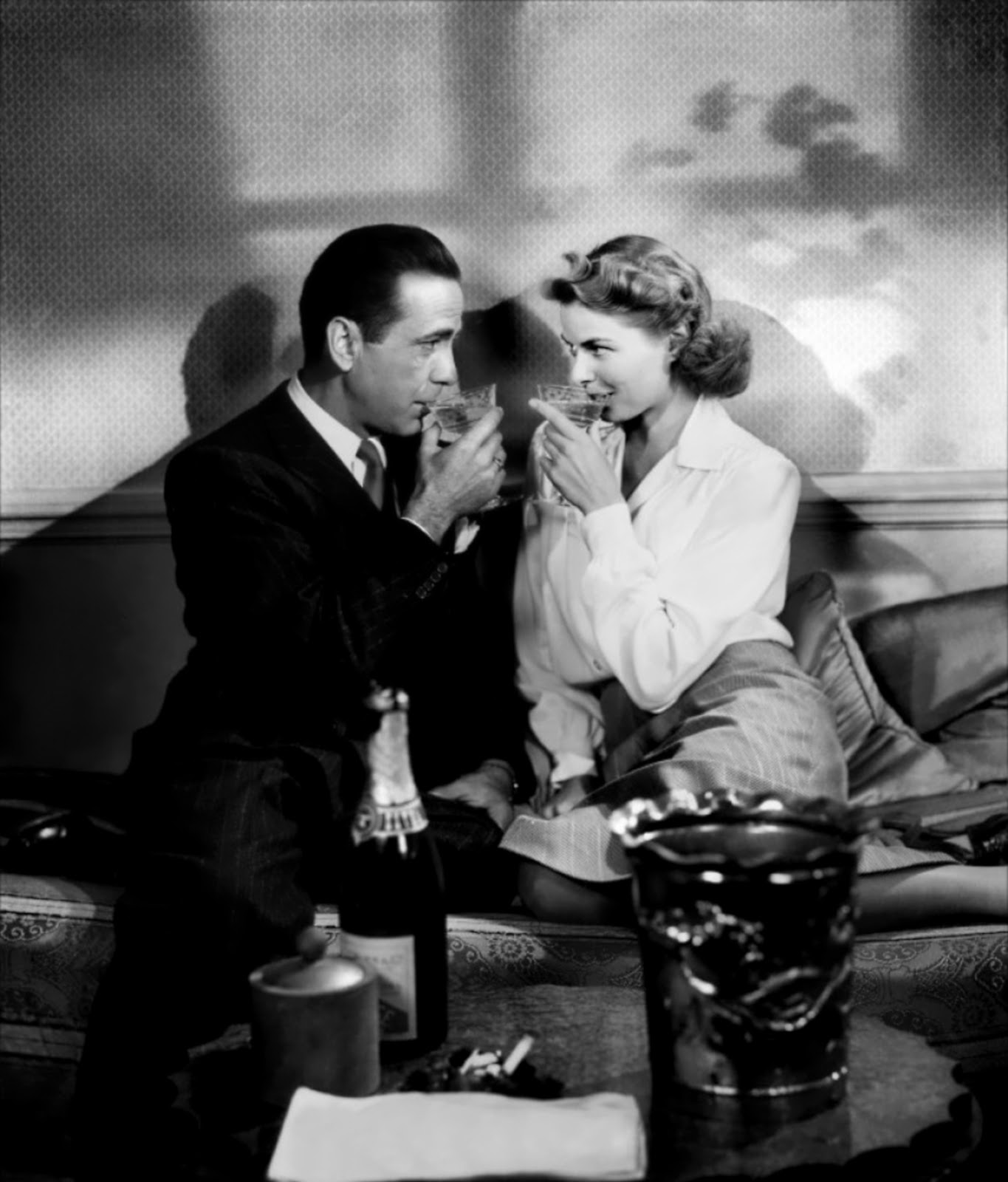
This week, I will be analysing Casablanca, a 1942 American romantic drama film directed by Michael Curtiz. The movie stars Humphrey Bogart as Rick Blaine and Ingrid Bergman as Ilsa Lund. 


Let's start by looking at the structure of the movie. It does not possess a chronological/linear narrative as the story is constantly interrupted by flashbacks of the two main characters and the history behind their ever-so-tragic love story. In one particular scene, Rick drinks alone after the bar closes. Sam, the pianist, plays "As Time Goes By" and Rick thinks about the past. In the flashback, we see a happier, less haggard Rick in Paris with Ilsa by his side. They drive through the city, ride a boat down the Seine, pop open a bottle of champagne, and dance at a club. Although they are clearly in love, they avoid all questions about each other’s pasts. When they hear word that the German army is approaching Paris, Rick knows he will have to leave the city. Rick proposes to Ilsa, who tries her best to hide her anguish, saying she doesn't plan that far in advance. Rick isn't worried, however. He thinks they'll leave together the next day for Marseille. At the train station the next day, Rick waits in the pouring rain, but Ilsa is nowhere to be found. Sam arrives and shows Rick a note. The note is from Ilsa and says that she can never see him again. The flashback ends with Ilsa entering the bar, eager to explain the cause of her action and the reason behind their parting but is then dismissed by a drunk and angry Rick.


The equilibrium is seen from Rick's successful business in opening his own cafe, with groups of people with different nationalities - consist of most important figures in society and members of the upper class. Disruption happens when his long lost former lover, Ilsa, arrives at the cafe with her husband, Victor Laszlo. From this moment on, Rick starts facing difficulties and obstacles, his mind disturbed as he discovers he still has strong feelings of affection for Ilsa and it might be reciprocated. Ilsa and Victor need the "letters of transit" in order to flee from Casablanca to America where Victor is able to continue working. The realisation takes place the night when Ilsa finds out the letters are in Rick's possession. She then confronts Rick in the deserted cafe. When he refuses to hand them in, she threatens him with a gun, but a sudden turn of event occurs as she vulnerably confesses her undying love for him. Realisation of disruption is when Rick decides to hand the letters, in hopes that Ilsa would leave Victor for him and stay in Casablanca. He finally realises and comes to his senses that Ilsa could not possibly leave her husband for him as that would make him selfish and at that time that seemed like a rash decision to follow through. In the end, he gave the letters to both of them, wishing them happiness and sacrificing his own. The new equilibrium is achieved as he watched, in despair, their plane flying off, accepting his own fate.


As for characters, it is obvious the main characters are Rick and Ilsa as this story mainly circulates around their romance. The hero is Rick, because he was the one who attempted to repair the disruption of equilibrium. The princess is Ilsa as she was the one who needed help (the letters and also deciding to stay with Rick or leave with her husband, Victor) The helper is Captain Louis Renault, who gave Ilsa and Victor permission to leave Casablanca. Major Heinrich Strasser acts as the villain, who tried to intervene, causing Rick to shoot him. Rick and Ilsa's backstory is evidently shown in Rick's flashback of them as a couple in love in Paris. Rick comes across as a tough, strong-willed person, rarely displaying his array of emotions but as Ilsa appears, he turns out to be almost as vulnerable as Ilsa is, giving in and letting his feelings take over him. Ilsa on the contrary, constantly has the perpetual argument on wanting to stay or leave. We see her being completely indecisive and is portrayed as a fickle-minded, unguarded woman.


The closure happens when Rick watches Ilsa and Victor's plane fly off to the distance, leaving him in Casablanca. Despite that, Rick seems to be content with his decision even though Ilsa seemed reluctant on leaving him. 

In terms of the clarity of the film, I think the story is pretty self-explanatory in a way that, everything is easy and clear to understand with a brief history of Casablanca being narrated in the exposition. The setting shows us the era of 40's from the costumes and backgrounds, and also the characters mention war pretty frequently which gives us the idea of the age of war, and they engage in them actively.

The theme centrals around romance but also there is a slight sense of bravery of the characters, striving in the early days of World War II. The theme romance was not even lucid at first, as the film focused more on soldiers / nazis and people of different nationalities. You would think it's a movie based on war and historical events but Ilsa is then introduced and everything changes from then, spilling the truth slowly.

Personally, I thoroughly enjoyed Casablanca - despite the heart wrenching ending - and it is, hands down, definitely a must watch movie. Undoubtedly, it beats most of the petty romantic films that are shown in cinemas nowadays.


Monday 26 January 2015

Cinematography: Raging Bull (1980)


We were given a task to analyse a film called Raging Bull directed by Martin Scorsese. The main protagonist as we know, is Robert De Niro who played Jake LaMotta, an Italian American boxer. He possesses negative traits that conclude him as a self-loathing person full of pure hatred and jealousy. He's been known as a bitter person with his constant obsessive rage. This film has won an Oscar for best actor as well as best film acting. 


Cerdan Fight

A long tracking shot was employed throughout Jake's entire journey to the ring. Eye level angle with a medium shot is also used. The whole purpose of this was to show his pace and progression which made us viewers feel as though we are a part of this, resulting in a deep connection. From here we can see how much of a confident and cocky person Jake actually is, he was practically oozing with confidence, overflowing at the seams. Despite that, he had a great support system around him whom all ushered him to the ring, giving out encouraging looks and cheers. The camera was in deep focus because the attention was not just focused on Jake but the background, settings and figures as well. The audience were obviously intently engaged in the outcome of the fight. 

As he was going up the entrance to the ring, a telephoto lens is used. This enables the process of zooming in and out easier to be made, so separation between Jake and the audience can be seen clearly. Selective focus with medium close up shot is used to divert the attention solely on Jake intensely determined to take down his opponent with all of his willpower. Panning is used when the referee pointed to Jake, introducing him - to show the connection between them both as at the end of the day, the referee will always be the one who decides the true winner. There was also a short medium close up of Jake's wife sitting in the audience - to acknowledge her existence and deep connection with Jake. Her facial expression was however practically unreadable. I mean if it was up to me, I'd say she seemed a bit unsure somehow. 

The fight is now ongoing with low angle and close up shots mostly used. Intensity is enunciated from this point of view, it's almost as though you can feel the vigorous punches and hits, right in the core. The close ups suggest the level of tension increasing - with both parties breathing deeply, drenched in sweat as the opponent announced he was too exhausted to even continue the fight. The high angle shot used evidently portrayed the weakness of the competitor, making him seem smaller than his actual size. 

At the end of the fight, a canted angle is shot to depict Jake's facial expression and details. The fight obviously wore him out and he used up all of his energy. The opponent slumped down, injured and tired with his head down - a sign of defeat. The referee walked up to Jake, probably to tell him he has won. This illustrated the extreme nervousness and tension is raised incredibly, leading to his winning moment. 


With all of that ending, a tilt shot is then used to show the championship belt on Jake's waist up to his face that basically radiated happiness, with his arms up, kissing his boxing gloves - a sign of victory. The audience went insane cheering for him, cameras flashing as they all empathise with him - proud and ecstatic at the same time. The significance of the belt and winning in general is exaggerated too - which interprets how crucial winning, victory and success is for Jake. Various types of angles are used such as eye, low and warm's eye angle. This exaggerates his shining, glory moment and we see him being represented as a dominant, powerful character in a much more superior and almost intimidating position. The light continues to shine upon him as his fame arises exceptionally.


Monday 19 January 2015

Mise en Scene: Metropolis (1927)

Metropolis, Fritz Lang (1927)

Metropolis is a 1927 German science fiction movie directed by Fritz Lang. What I find absolutely fascinating about this movie is the fact that some portions of it were lost throughout the years and futile attempts were made to restore it entirely, resulting in different versions of the movie itself. I watched a version where the graphics were tinted with blue and white or red and white colour themes rather than just black and white, as well as another one with a horrible choice of score - nevertheless, still interesting to watch. Metropolis is set in a futuristic urban dystopia, complete with the portrayal of flying cars and advanced technology development like robots or Machine Human. The cost of the movie was approximately five million, which at that time, made it the most expensive film ever released. It had a simple cinematography and I have to admit, the storyline caught my attention.


In the first location it illustrated the City of The Workers. In this scene the workers of the factory were walking in groups in an organised and orderly fashion. They had their heads down almost the entire time with shoulders slumped as if too exhausted and disoriented to do any work. The setting was gloomy and the music being played fit in well - almost too depressing if I may add. In one section, the workers were each confined in a small space as if they were trapped which could also represent their unwillingness to work under pressure by the upper class citizens. This is the starting point of the prospect that something horrible will definitely happen.

On the contrary, in the second location, there was a complete change of scenery and mood. Clearly shown, was a couple of the upper class - both dressed properly and showered in luxuries. Both parties were frolicking around a fountain in the Eternal Gardens of Pleasure. There were pretty flowers and the frame was shot with greater space compared to the first location - this probably represents the true meaning of freedom they both possess. The colours used were also far brighter with hints of gold / yellow tones constantly associated with happiness.


From this scene, they indirectly introduced the main protagonists which were John Freder, the son of Master of Metropolis and the daughter of one of the workers which I later found out, is named Maria. She barged in with a huge group of children, with a sole purpose to point out to them the tremendous differences between the privileged and the working class, only to find herself interrupting Freder. She then was hurriedly ushered away. Freder found himself in a state of awe and astonishment, leading him to chase Maria all the way into the workers' city. This is where two different worlds collide and individuals of different statuses intertwine resulting in a beautiful yet tragic love story.

Unfortunately from here, it all went downhill. He arrived exactly in time for a horrible explosion to take place causing the workers to be badly injured. During this experience, Freder sat in shock - literally gobsmacked by the mishap happening in front of him. Following the catastrophe, the atmosphere had a complete 360 degree turnover intact with colour and graphic changes. The operational machine turned into something monster-like, a horrendous creature with its mouth wide open. Egyptian slaves were being carried into it, as if being eaten up alive - followed by the workers - again walking in huge groups in a formal, systematical manner, up the stairs to enter of what could have been a portal or some sort of secret passage. This may or may not have been Freder's hallucination but either way, it depicts the ideology of capitalism where the ruling class will always have the overbearing power over a lower class of underground-dwelling workers. This could also relate with the perpetual act of slavery and forced labour where the unprivileged suffice to jobs that are apparently only up to their levels/standards. 

To sum up, the movie was utterly a great experience. I enjoy venturing into the divergence of movies where important messages are often offered and conveyed. Overall I would say it was a movie that explored every aspect of emotions. I highly recommend it if you're a hardcore sci-fi fan, or even if you're not! This would surprise you in so many ways as without this iconic movie, we probably will not get most of the successful movies today.


Wednesday 14 January 2015

Brighton Pier

Brighton Pier at its finest